
“lvl up!” is an ecommerce website/app designed for gamers to purchase all of their equipment in one place. The age of the typical user ranges between 18 - 35 from casual to pro-level experiences. “lvl up!” is the site for gamers by gamers with gamers’ needs at the forefront!
Project Duration: August 2024 -December 2024
The problem:
Current e-shops for gaming parts and materials are hard to navigate and have too much information crammed into cluttered sites/apps. The checkout process is usually overly complicated.
The goal:
We designed “lvl up!” to remove the clutter and only include the information that matters to gamers to speed-line the checkout process. We hope to make shopping easier for all gamers, no matter your level of experience.
My role:
Lead UX Designer and researcher
Responsibilities:
Interviews, wireframes, lo-fi & hi-fi prototypes, usability studies and modifying designs to be responsive
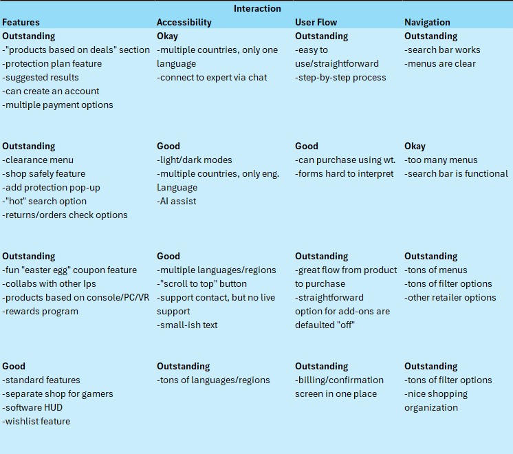
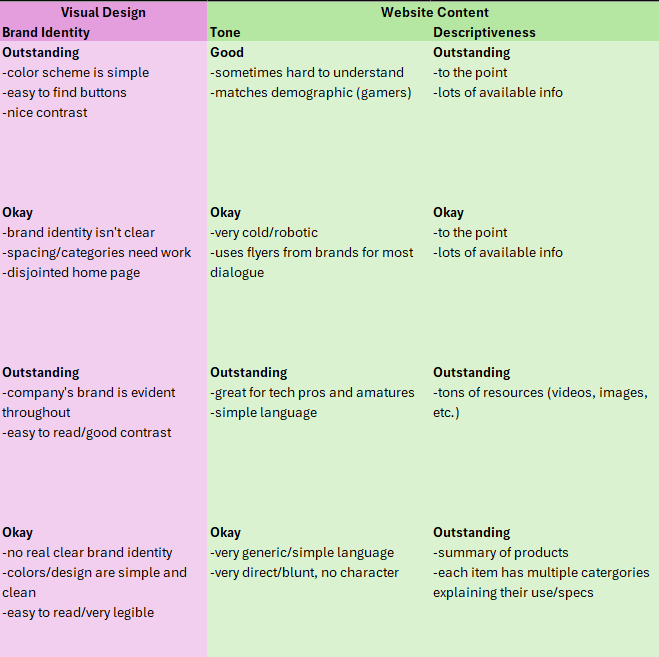
I’ve done website audits to determine the type of ecommerce sites out there for gaming equipment. I also conducted interviews with gamers between the ages of 25 - 35 to gain insight into the type of website they would like to have for purchasing equipment. I found that many users were upset with the lack of clarity when trying to find that they need. They were also struggling with the “checkout” process when attempting to purchase products. This matched the audit I performed where I found many of the sites to lack visual clarity and a user flow to purchase products from their sites.

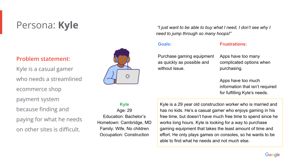
Using the information gathered from the interviews I’ve conducted, I’ve created a persona to sum up the main issues users faced when using other ecommerce sites to shop for computer parts and accessories.
Pain Points
Info clutter
Issues with cluttered sites (needed info hard to find).
Navigation
Navigation isn’t streamlined in the search process.
Confusing forms
Equipment information and payment forms are hard to interpret.

I created a user journey map to assist “Kyle” in making the purchasing process for PC equipment easy and clear.
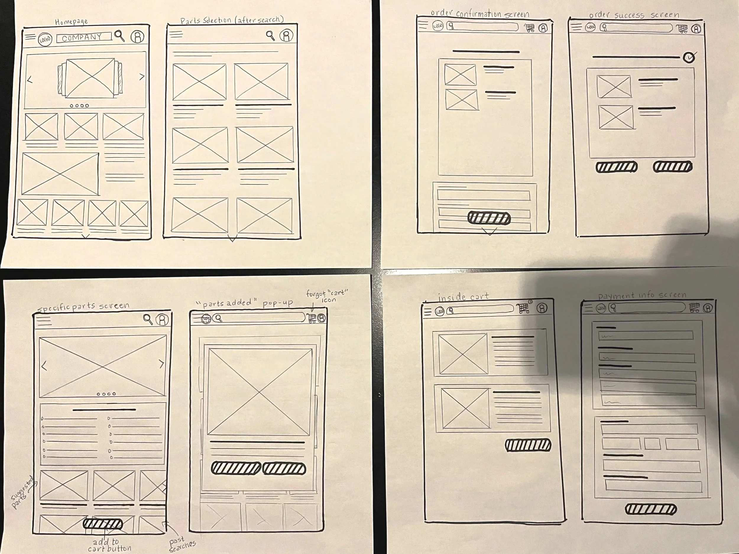
Paper Wireframes
Using the user journey I’ve mapped out for the app, I began sketching iterations of what the app might start to look like.
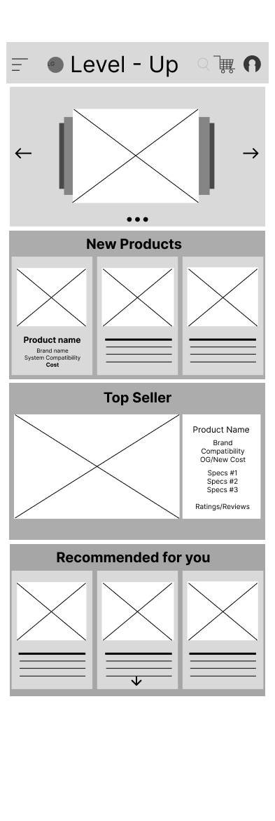
Digital Wireframes
Once I’ve moved to a digital format, my goal was to add placeholders for images and the navigation bar to showcase the direction I’m planning to take in addressing navigation issues.
Click the image to test out the prototype of the user-flow
Large images with text descriptions to assist with quick access to other pages within the site.
Simple, easy to read navigation bar with clear titles to show how to use each feature.


Mockups


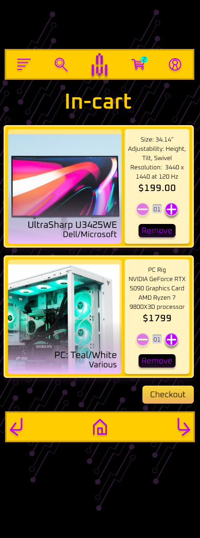
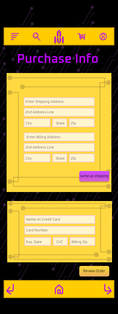
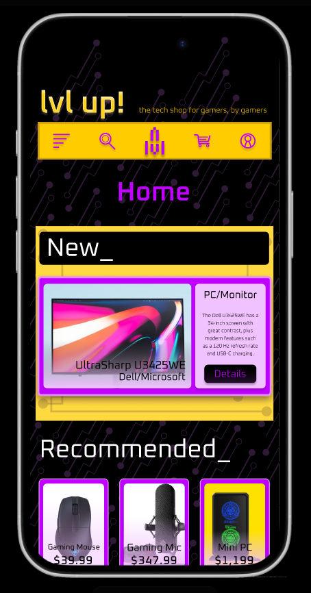
Once I’ve finalized the lo-fi designs, I’ve moved on to the hi-fi version adding the design elements I came up with to add personality to the functionality.
Usability Study
Answers to the following question: Are there any features/inclusions you would like to have in this app that would make this process any easier?
Chris Mikules || Age: 28 || Gaming Experience: Expert
“Clearer text on product images on homepage, could be difficult to read product names without a more opaque background (or put the name under the image of the product instead of over it) since it’s black text directly over the product.
Feel like buttons should be aligned on review page (“same as shipping “ isn’t lined up with review order.”
Jake Levine || Age: 34 || Gaming Experience: Casual
“No, I think the app ran very well and was not confusing at all.
Maybe a brief description of what you can find on this website could be a nice touch. But that’s very nitpicky. I think it is great and easy to navigate as is.”
Billy Dinkel || Age: 30 || Gaming Experience: Expert
“The only thing I can think of is a widget of sorts to actively display the cart, be it a scrolling sidebar or similar. As a user, this helps keep track of what I would be spending, and allow reprioritization if necessary.
Someone assembling a new gaming setup likely has a budget in mind, and I think a feature such as this would allow them to easily decide on something.
Having this display on the fly seems more convenient than having to navigate back and forth between the cart and other pages.”
Lisa Tompkins || Age: 38 || Gaming Experience: Casual
“Nope! Very easy and straight forward.”
Accessibility considerations
Sectioning with clear headers, adding hierarchy and working with website nav assist programs.
1
Using easy to identify icons to clarify buttons’ uses.
2
I provided multiple ways to move across screens when shopping to ensure users aren’t stuck during the purchasing/shopping process.
3
Next steps
Follow up with users from the study to confirm changes made with meet their needs.
Cross reference the “finished” site with other sites to make sure goals are met.
Takeaways
Impact:
Our users have expressed their gratitude for the easy navigation features as well as their ability to find what they’re looking for with the simple design layout.
What I learned:
I’ve learned the basics of what is required when building an app, from the research to the design. I’ve also learned how important feedback is for updating and finalizing a product.