
A follow up to the ecommerce app developed in a previous project, this website is meant to expand on the ideas and functionality to provide a heightened user experience.
Project duration: June 2025 - August 2025
My role:
Lead UX Designer and researcher
Responsibilities:
Interviews, wireframes, lo-fi & hi-fi prototypes, usability studies and modifying designs to be responsive
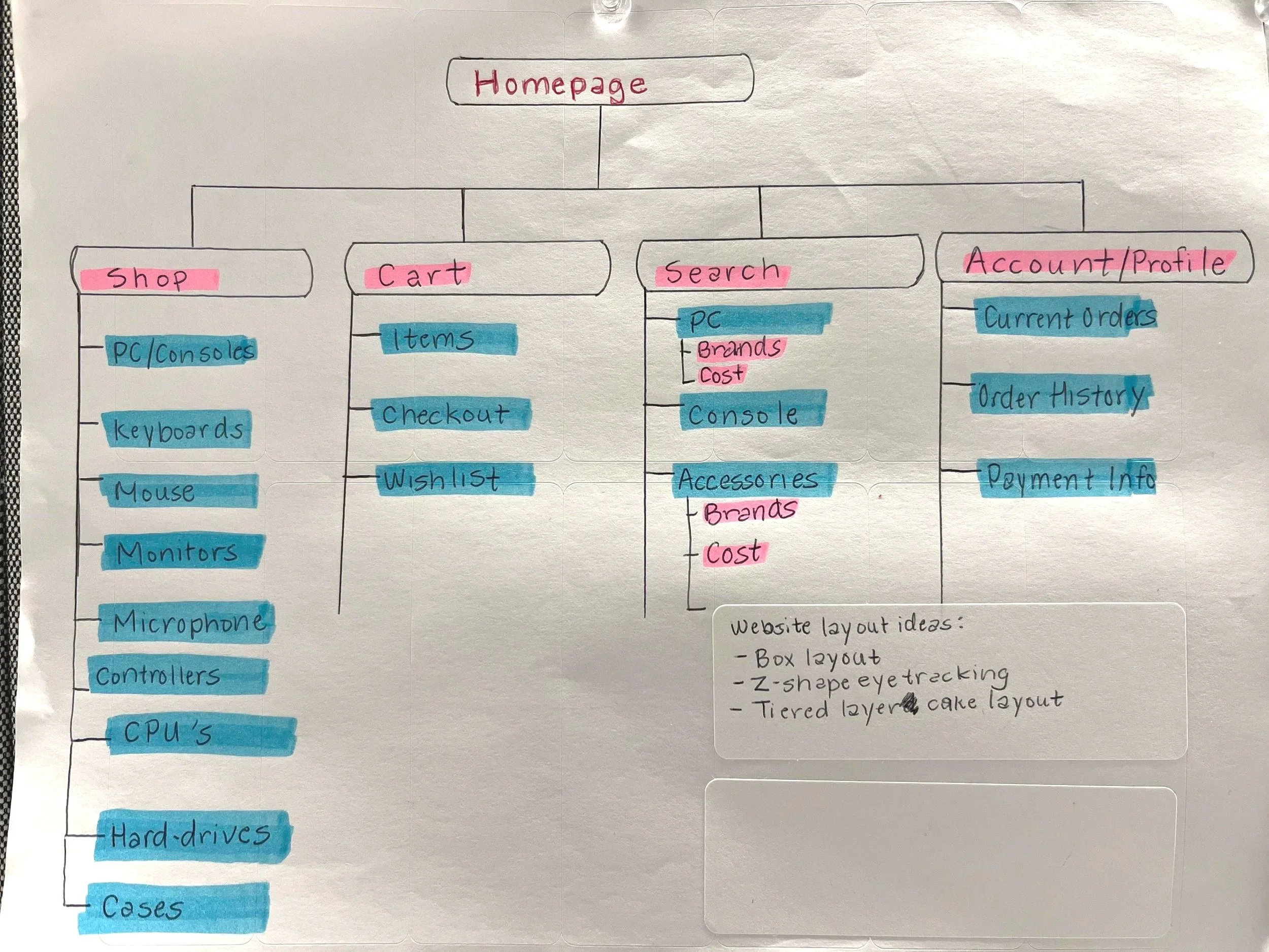
Sitemap
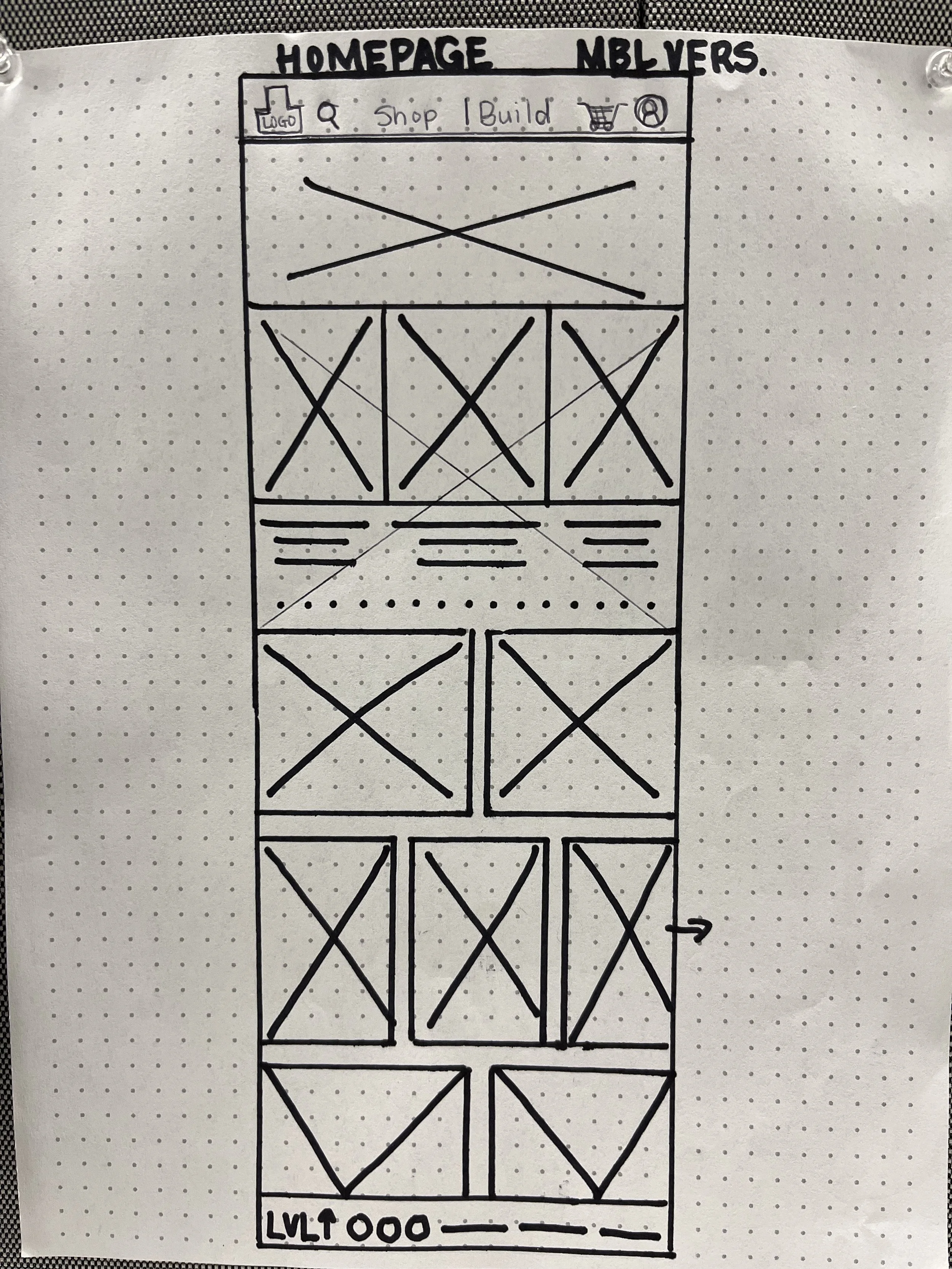
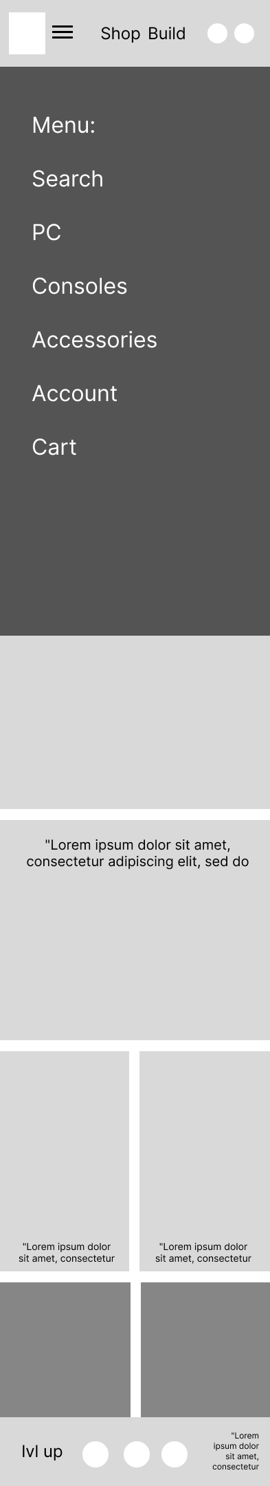
Paper Wireframes
Here’s an example of the sketches of the wireframes based on the site map I’ve created.
The homepage here demonstrates my vision for the website to assist with displaying a clear picture of the ecommerce site.

Tablet Version
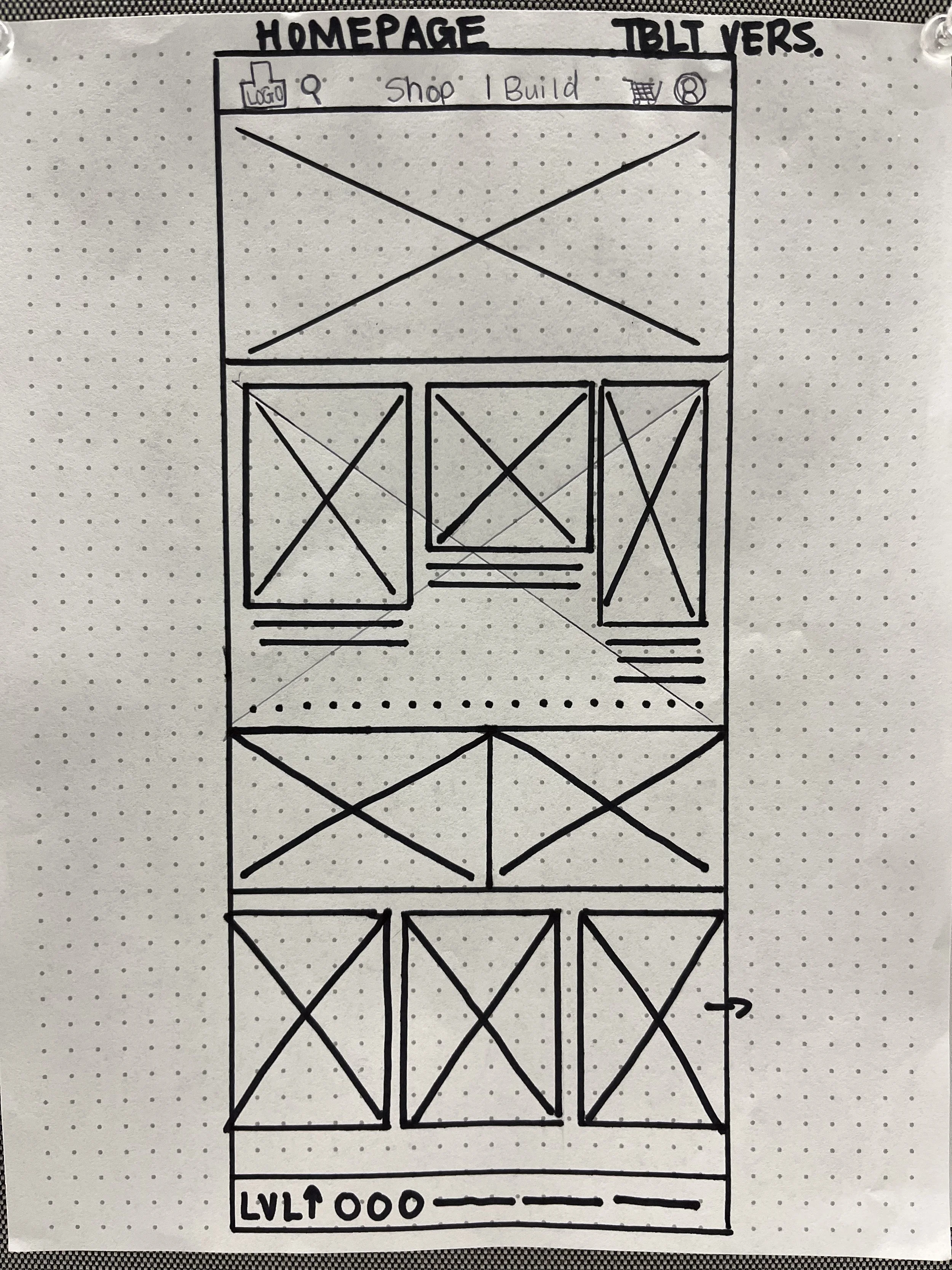
Paper Wireframe Screen Variations
Mobile Version
Digital Wireframes
Once I’ve moved to a digital format, my goal was to add placeholders for images and the navigation bar to showcase the direction I’m planning to take in addressing navigation issues.
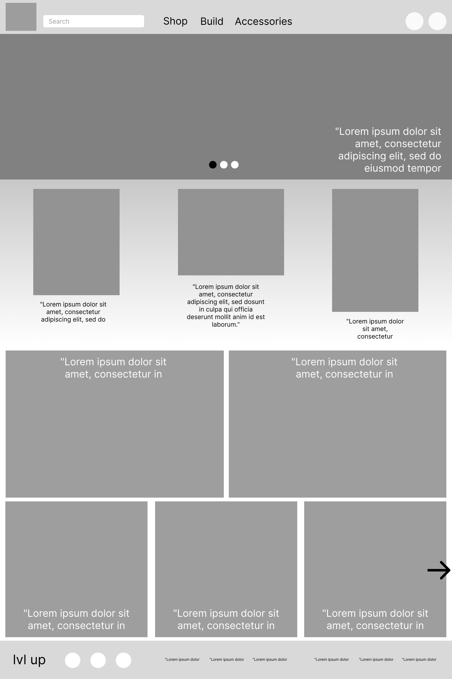
Screen Size Variations

Lo-Fi Prototype
Usability Study
Study type:
Unmoderated usability study
Location:
United States, remote
Participants:
5 participants
Length:
20-30 minutes
Findings:
A user found that selecting their preferred credit card type was missing.
Mockups


Item View Page
Homepage
Shop Page

Account Page


“In-Cart” Page
Checkout Page

Order Confirmation Page

Mockup Size Variation
Homepage
Shop Page


Search Results Page
“In-cart” Page


Based on the notes from the study, I’ve made some updates to the original design to add a credit card type option. This will give users more payment options to included various payment types.
Before usability study
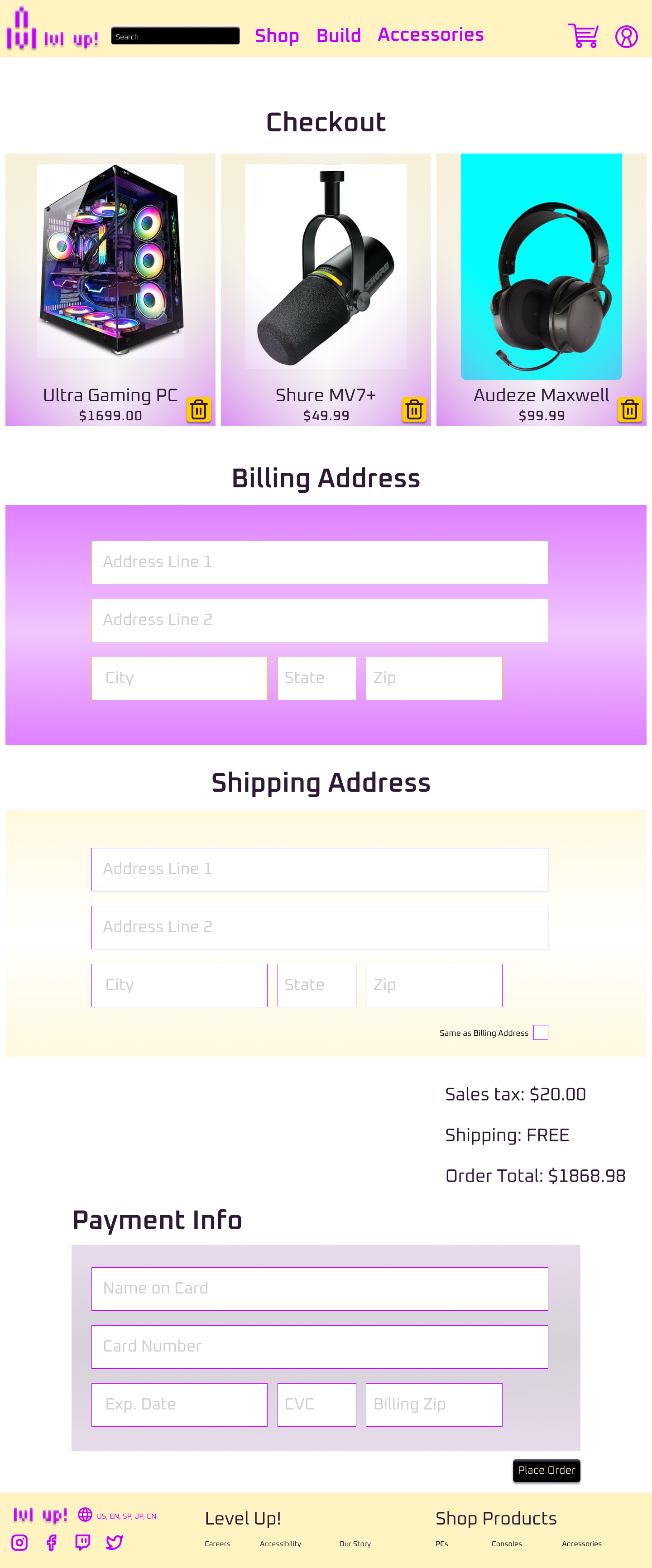
After usability study

Hi-Fi Prototype
Accessibility considerations
Sectioning with clear headers, adding hierarchy and working with website nav assist programs.
1
Using easy to identify icons to clarify buttons’ uses.
2
I provided multiple ways to move across screens when shopping to ensure users aren’t stuck during the purchasing/shopping process.
3
Impact:
Users appreciate the easy-to-follow structure along with legible text. They’ve expressed the pleasing color scheme that helps to view the content shown as well.
What I learned:
I’ve learned a ton of new skills from researching websites and users to gestalt principles implemented in everyday design practices.